How to Design Product Page That Actually Convert (For Indian Dropshipping Stores – 7 Steps)
Let’s not waste time. Most beginners think a product page is just a place to dump photos and copy-paste specs from the supplier. That mindset alone is killing your conversions. Your product page is your 24/7 salesperson. And in Indian dropshipping, where customers are paranoid, skeptical, and addicted to COD — this page has to do all the heavy lifting.
Table Of Content
No trust = no sale. No clarity = bounce. No urgency = scroll.
If your product page isn’t selling for you, it’s leaking traffic and burning ad money.
So how do you fix it? How do you actually create a page that gets people to stop scrolling, feel safe, and confidently hit that ORDER NOW button?
Here’s how. No fluff. Just what works
1. Killer First Impression of Product Page (Above the Fold)
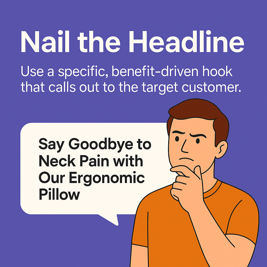
First 3 seconds decide everything.
People landing from ads aren’t reading your page, bro — they’re just skimming, deciding in a blink whether to stay or bounce. So your top section? It better hit hard.
Here’s what needs to slap right away:
- Clean product name that clearly says what it is and why it matters. No filler.
- One sharp hero image — no crowded collages or supplier junk. Make it premium. Think mobile.
- Your strongest offer front and center: “BUY 1 GET 1 FREE”, “COD Available”, “Only Today” — it should punch.
- Trust signals — payment icons (Razorpay, GPay), delivery timelines, return badge. Let people feel safe.
- A bold AF CTA — not hidden halfway down the page. “ORDER NOW (COD Available)” should be right there screaming.
90% of your traffic is mobile. If your CTA is buried, you’re basically setting money on fire.
✅ Pro Tip: Use a sticky “Buy Now” bar on mobile. That one tweak alone will increase conversions big time.
2. High-Quality Visuals (Photos & Videos)
Let’s be real — people in India scroll fast. They judge your product in 1.5 seconds. If your images are weak, they’re gone. No second chances.
Your visuals have one job — sell without talking.
So stop using those garbage AliExpress supplier photos that look like they were clicked on a Nokia in 2011.
Instead, show off your product like it deserves to be bought:
- Show multiple angles on clean white background (make it pop)
- Add real-life usage pics — how it looks in a hand, on a desk, etc.
- If it’s a problem-solving product, throw in a before/after visual
- Add short demo videos or GIFs showing it in action — show, don’t tell
✅ Pro Move: Add a voiceover-based video explainer. Hook them in with “Here’s how this product saves your day…” and let the video do the convincing.
This one tweak alone can shoot up your conversion rate.
3. Problem-Solution Hook in Description

Nobody cares what your product is. They care what it does.
So stop writing boring specs and start selling the outcome. Lead with a punchy hook:
- What problem does it solve?
- Who exactly needs it?
- Why is this better than the cheap stuff out there?
Make it about them, not your store.
Then go into the good stuff — key benefits, main features, how to use it. Keep it skimmable.
✅ Format like this:
- Bold headline
- Clean bullet points
- A few well-placed emojis (don’t overdo it like a WhatsApp forward)
✅ Bonus Move: Add an FAQ section at the bottom of your product description. Handle the common objections like:
- Will it fit me?
- Is it COD?
- How long delivery takes?
Handle objections before they bounce.
4. Trust Triggers (For Indian Buyers)
This is where 90% of new dropshippers flop hard.
In India, buyers don’t trust random stores. You have to over-prove you’re real.
So plug these in visibly:
- A clear “COD Available” badge (non-negotiable)
- Free Shipping + Easy Returns section right below price
- WhatsApp chat button for pre-sale doubts
- Verified reviews with actual names & cities (not “user123”)
- Payment gateway icons (Razorpay, Cashfree, Paytm)
✅ Pro Move: Add something like “Delivered in 4–6 days” near the CTA. Creates trust and urgency.
This section builds belief. Without it? They bounce, even if your product is gold.
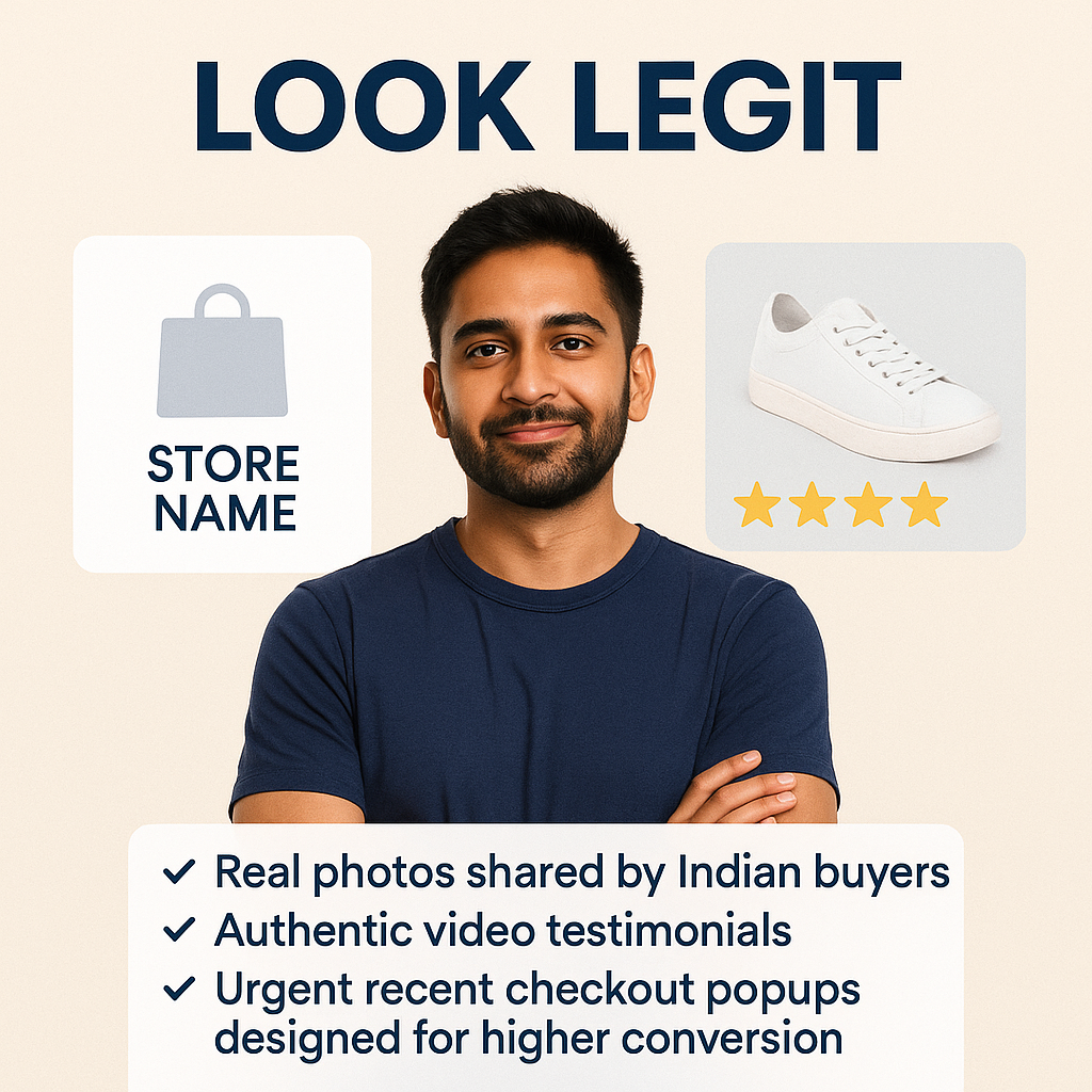
5. Social Proof That Feels Real

Don’t fake reviews. Everyone knows.
Instead, build real trust with content that feels legit:
- Real buyer photos — preferably taken on Indian phones, with names like “Pooja from Pune” or “Ravi, Bangalore”
- Drop in 2–3 video reviews if you have them — even selfie-style ones work better than polished garbage
- Star ratings placed near the buy button (above the fold)
✅ Pro Move: Use a “Recently Bought” popup or stock countdown widget (like “102 sold today”) to create FOMO.
Your buyer wants proof they’re not the guinea pig. Give it to them.
6. Offer Stack + Urgency
Offers move the needle. No offer = no excitement.
Here’s what works best for Indian traffic:
- “Buy 2 Get 1 Free” — simple and proven
- “Oin stock” — scarcity hits hard
- “Prepaid orders get a free gift” — helps reduce RTOs
And layer it with urgency:
- Countdown timers (use only if it’s real)
- “Selling fast” or “50 bought in last 24 hours”
- “This price goes up at midnight” style messaging
✅ Pro Move: If you’re running a prepaid incentive, hammer it everywhere. Banner, price section, checkout — make it loud.
You’re not running a museum. Add heat.
7. Clear CTA Buttons (Repeated & Bold)
One button won’t cut it.
Put your “Buy Now” or “Add to Cart” buttons in at least 3 places:
- Right after product price
- After your reviews
- At the very bottom
And don’t let your CTA blend in. It should stand out — bold colors, big text.
✅ Pro Move: Add “ORDER NOW (COD Available)” — that COD part adds massive trust instantly.
Also? Make sure it’s mobile-friendly. If the button lags, glitches, or hides — they’re gone.
Make clicking easy.”
Final Words
This ain’t a fancy brochure. It’s a battleground.
You’re fighting for trust, attention, and clicks — in a market where people bounce if they sense anything shady.
Every block on your page needs to earn its place. If it doesn’t sell, it goes.
Remember:
- Hook fast
- Show value
- Kill doubt
- Push action
You do this right? You turn ad clicks into buyers.
✅ Want more real-talk breakdowns like this? 👉 Subscribe to Dropshipping.blog and upgrade your store strategy for India.


